You might have heard about recent reports stating that global inequality is decreasing. This is a nice example of constructing the comparison according to the result you would like to see. Yes, inequality between countries has declined but the most important comparison is what is happening to inequality within countries as this tells you how the distribution system, that is under direct political control, works. And if you look at this you can only shake your head in disbelief.
Pavlina Tcherneva tweeted two graphs from her research that were also picked up by Vox.com. The graphs answer a simple question: Who actually got what share of growing national income in different periods of time? Here is the answer for the US:
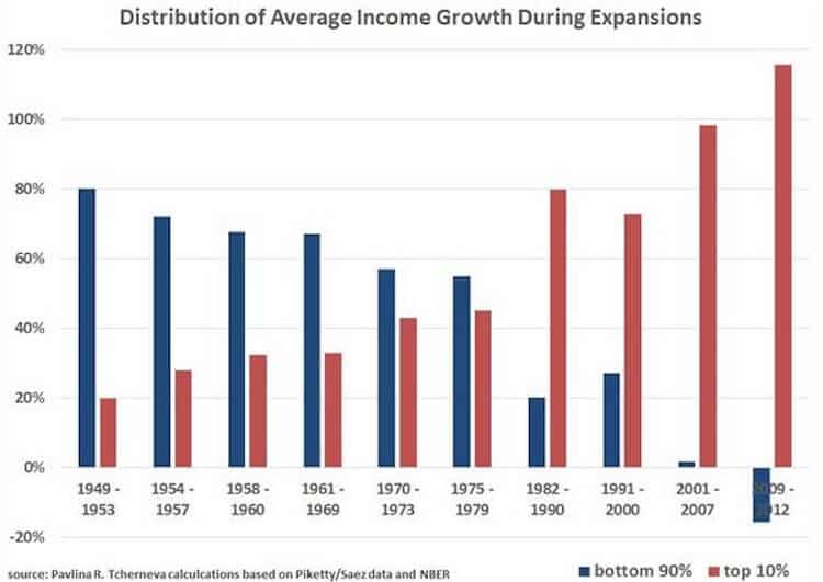
Is there any question that there is something fundamentally wrong with this distribution? And if you think this is only the case in the US look at the equivalent graph for Sweden:
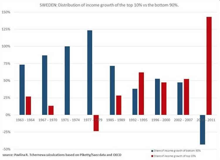
Something is going seriously wrong here! If you look at one graph that tells you all you need to know about income inequality look at who actually takes home the gains of economic growth.